wavival.dev
wavival.dev is my portfolio and also a design case. The system is called @wavival | Design System v4: the page reads like an editorial index, with 1px rules instead of boxes, large Raleway 800 headlines, numbered indexes, and a single blue signal on a quiet field. It started in Claude Design as a prototype and design system, and was brought to code with token parity. It is bilingual (Spanish at the root, English under /en), static, and dark by default.
By Valentina Ramírez
Published: October 1, 2026 · Updated: October 2, 2026
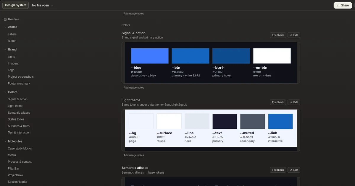
This portfolio as a design case: the @wavival | Design System v4, editorial and static, with rules instead of boxes, a single blue signal, and AA contrast in both themes. Bilingual, built on Astro and Tailwind, designed in Claude Design.
- Astro
- TypeScript
- Tailwind CSS
- Vercel
- Playwright
The problem
A developer portfolio often ends up as a template: shadow cards, accent colors that fail contrast, animation that competes with the content, and a design that in code no longer looks like the prototype. I needed a site that was itself proof of my technical and design judgment: fast, accessible, bilingual, and with a recognizable identity.
Generic template
Shadow cards and radii everywhere: it looks like any other portfolio.
Fragile contrast
The previous accent blue only reached 3.24:1 with white text, below AA.
Decoration over content
Scroll animation and icons on every link compete with what matters.
Prototype and code drift apart
The design says one thing and the published site another, because nothing forces them to stay equal.
What I built
- 01
Astro 7 with static output and TypeScript. Tailwind 3 mapped to CSS tokens, and client scripts in vanilla TypeScript only for the theme, the mobile menu, and the project filters.
- 02
Atomic structure (atoms, molecules, organisms, and a single template). Organisms receive the language and localized routes come from a single function.
- 03
Own i18n: Spanish at the root and English under /en, with the slug map as the single source of truth for the language toggle, the sitemap, and hreflang.
- 04
Typed content (projects and stack) with parallel English fields. Every case study is generated from a single array.
- 05
SEO and discovery: JSON-LD with Person, Organization, and WebSite, per-project OpenGraph, a sitemap with reciprocal alternates, and llms.txt for AI assistants.
- 06
Performance: self-hosted fonts in a Latin subset, LCP image preload only where it is used, and View Transitions between routes. Core Web Vitals are reported to Umami when configured.
- 07
Header security: hash-based CSP, no unsafe-inline on scripts, with a CI guard that recomputes the hash of every inline script.
- 08
Deployment on Vercel with microfrontends (the portfolio and NullBreach share a domain) and a single serverless function for the quote form, which sends through Brevo.
- 09
A dev, stg, and main flow with commitlint, Playwright E2E tests, Lighthouse CI, and link checking as quality gates.
Design
- 01
@wavival | Design System v4: the page reads like an editorial index, with one blue signal on a quiet field.
- 02
Designed in Claude Design, with a clickable prototype and its own design system. The site replicates the prototype token by token.
- 03
Rules, not boxes: structure comes from 1px lines. There are no shadows, surfaces have radius 0, and controls have 2px.
- 04
A single blue signal with separate roles: one blue for text, icons, and focus; another for fills and large text; another for the indexes; and another for the primary button. Each one passes contrast in its use.
- 05
Editorial scale: Raleway 800 in fluid sizes with 0.9 to 1 line height on headlines and negative tracking; Poppins for body. Both self-hosted.
- 06
Numbered indexes (01, 02) as a reading guide, and every section opens with a 1px rule.
- 07
A single column at the full container width (1280px), with vertical rhythm defined by spacing tokens.
- 08
Icons only where they work: on icon-only buttons and on the primary button. Text links and buttons carry no arrows.
- 09
State is told with text: the accordion is a native details element that shows "View" and "Close" instead of a chevron.
- 10
Dark by default and toggleable. A script before first paint applies the theme without flicker, the theme is class-based and not a media query, and the browser color stays in sync.
- 11
Accessibility as a design constraint: 2px visible focus, AA contrast computed per token in both themes, 44px touch targets, a mobile menu with trapped focus, and respect for prefers-reduced-motion.
- 12
Minimal, functional motion: no scroll animation, only short transitions, View Transitions between routes, and a 220ms accordion.
- 13
The system is documented: tokens, component classes, and the catalog live in DESIGN.md and COMPONENTS.md.
Architecture decisions
01 Rules instead of boxes ViewClose
- Context
- Shadow and radius cards are the default pattern of almost any portfolio.
- Trade-off
- Without shadows or radii, hierarchy depends on typography and space, and demands more care.
- Decision
- Structure with 1px lines, radius-0 surfaces, and lists drawn with borders. Hierarchy comes from the scale and the indexes.
02 One blue signal, four roles ViewClose
- Context
- The previous accent only reached 3.24:1 with white text, and a single blue cannot pass contrast for small text and for fills at once.
- Trade-off
- Four blue tokens are more to maintain than one, but a single blue forces you to give up contrast or presence.
- Decision
- One blue per role (text and focus, fills and large text, indexes, primary button). The button fill is the same in both themes so white text stays above 4.5:1.
03 Editorial scale with self-hosted type ViewClose
- Context
- The site identity depends on large, tight headlines that load without layout jumps.
- Trade-off
- Self-hosting requires generating the subsets and preloading; a third-party font is simpler but adds a request and a point of failure.
- Decision
- Variable Raleway (600 to 800) and static Poppins in Latin subset and woff2, with font-display swap and preload only for the critical weights.
04 Static, with no scroll animation ViewClose
- Context
- An animation that hides content until it appears competes with reading and with performance.
- Trade-off
- A static site feels less spectacular, but the design leans on typography and rhythm.
- Decision
- No scroll reveal and no animation library. A native accordion with state in text and only short transitions, all disabled with prefers-reduced-motion.
05 Dark by default, by class ViewClose
- Context
- Following the system preference leaves the design to the device, and switching theme after first paint causes a flicker.
- Trade-off
- Fixing dark as the start ignores the system preference, and an inline script forces the CSP to stay hash-based.
- Decision
- A synchronous script at the top of the head applies the dark class before styles load, unless the user saved the light theme. The CSP includes that script's hash.
06 Spanish at the root, English under /en ViewClose
- Context
- The site serves clients in Spanish and English, and each page needs its equivalent.
- Trade-off
- Translated slugs improve local SEO but require maintaining the mapping between languages.
- Decision
- Spanish slugs at the root and English slugs under /en, with a single map feeding the language toggle, the sitemap, and hreflang.
Results
- Bilingual site in production at www.wavival.dev, with 34 static pages across Spanish and English.
- Design implemented with parity to the Claude Design prototype.
- Quality gates on every change: Playwright E2E tests, Lighthouse CI (accessibility and SEO with a 0.9 minimum), and checks for broken links, CSP hashes, and CSS classes.
Learnings
A design system is only worth something if it becomes tokens: every color and size lives as a CSS variable and components carry no loose values.
Contrast is decided in the token: the previous accent (3.24:1) forced separating one blue per role.
Tailwind purges classes built from fragments (btn-${variant}). Components must use complete class names.
A backdrop-filter makes the element the container of its fixed children: the mobile menu had to be a sibling of the header and not a child.
A component named like a Tailwind utility inherits its styles wherever the utility is used: .text-link became .action-link.
Your next idea deserves code that can carry it.
I design and build complete products: from the backend to the interface your users love. With integrated AI and security by design.
Projects from USD 250 / COP 1,000,000 depending on scope (MVP from 3-6 weeks). Limited availability, I respond within 24h.
 Start my project